MapShoulder
MapShoulder
MapShoulder
Tool for shoulder health assessments
Tool for shoulder health assessments
Tool for shoulder health assessments
When
When
When
May 2024 - September 2024
May 2024 - September 2024
May 2024 - September 2024
Role
Role
Role
Research Assistant |
UX/UI Designer
Research Assistant |
UX/UI Designer
Research Assistant | UX/UI Designer
Tools
Tools
Tools
Uizard, Figma, Covidence
Uizard, Figma, Covidence
Uizard, Figma, Covidence
Sector
Sector
Sector
Digital Health, Healthtech
Digital Health, Healthtech
Digital Health, Healthtech

PROBLEM
PROBLEM
PROBLEM
Inaccurate shoulder health assessments often result in costly misdiagnosed treatments, burdening patients with unnecessary expenses and delayed recovery.
Inaccurate shoulder health assessments often result in costly misdiagnosed treatments, burdening patients with unnecessary expenses and delayed recovery.
Inaccurate shoulder health assessments often result in costly misdiagnosed treatments, burdening patients with unnecessary expenses and delayed recovery.
Overview
Overview
Overview
Our project aims to create a medical guide tool to help general practitioners assess shoulder health more effectively. The current 16-page assessment document from Alberta Health Services is complex and difficult to use, making the evaluation process less efficient.
To address this, our supervisor, Dr. Breda Eubank from Mount Royal University, condensed the document into a one-page guide. However, even in this simplified form, it remains difficult to navigate. This project builds on her efforts to develop a more user-friendly solution for accurate and efficient shoulder health assessments.
Our project aims to create a medical guide tool to help general practitioners assess shoulder health more effectively. The current 16-page assessment document from Alberta Health Services is complex and difficult to use, making the evaluation process less efficient
To address this, our supervisor, Dr. Breda Eubank from Mount Royal University, condensed the document into a one-page guide. However, even in this simplified form, it remains difficult to navigate. This project builds on her efforts to develop a more user-friendly solution for accurate and efficient shoulder health assessments.
Solution
Solution
Solution
Our solution is a digital tool that helps users assess shoulder health by collecting key patient information, including demographics and diagnostic concerns. It flags potential red and yellow markers for shoulder conditions and suggests nearby emergency care centers and musculoskeletal specialists, providing comprehensive support for better decision-making.
Our solution is a digital tool that helps users assess shoulder health by collecting key patient information, including demographics and diagnostic concerns. It flags potential red and yellow markers for shoulder conditions and suggests nearby emergency care centers and musculoskeletal specialists, providing comprehensive support for better decision-making.
Our solution is a digital tool that helps users assess shoulder health by collecting key patient information, including demographics and diagnostic concerns. It flags potential red and yellow markers for shoulder conditions and suggests nearby emergency care centers and musculoskeletal specialists, providing comprehensive support for better decision-making.

Research
Process
Research
Process
Research Process
This project followed a three-phase approach to validate the need for a digital clinical decision tool and create an initial prototype.
This project followed a three-phase approach to validate the need for a digital clinical decision tool and create an initial prototype.
This project followed a three-phase approach to validate the need for a digital clinical decision tool and create an initial prototype.
Phase 1
Phase 1
Phase 1
Stakeholder Engagement
Stakeholder Engagement
Stakeholder Engagement
Identify user needs and pain points in patient care.
Identify user needs and pain points in patient care.
Identify user needs and pain points in patient care.
Phase
Overview
Phase
Overview
Phase Overview
I started the project by interviewing key stakeholders to understand the challenges clinicians and patients face in shoulder health assessments. Clinicians shared that misdiagnoses often lead to unnecessary treatments, expensive MRIs, and long wait times for avoidable surgeries. These inefficiencies drive up healthcare costs and delay patient recovery.
I started the project by interviewing key stakeholders to understand the challenges clinicians and patients face in shoulder health assessments. Clinicians shared that misdiagnoses often lead to unnecessary treatments, expensive MRIs, and long wait times for avoidable surgeries. These inefficiencies drive up healthcare costs and delay patient recovery.
I started the project by interviewing key stakeholders to understand the challenges clinicians and patients face in shoulder health assessments. Clinicians shared that misdiagnoses often lead to unnecessary treatments, expensive MRIs, and long wait times for avoidable surgeries. These inefficiencies drive up healthcare costs and delay patient recovery.
User Pain Points
User Pain Points
User Pain Points
Clinicians struggle with inconsistent assessments, lack of standardized tools, and inefficient documentation.
Clinicians struggle with inconsistent assessments, lack of standardized tools, and inefficient documentation.
Clinicians struggle with inconsistent assessments, lack of standardized tools, and inefficient documentation.
Patient Pain Points
Patient Pain Points
Patient Pain Points
Patients experience delays in diagnosis, miscommunication, and uncertainty about treatment progress.
Patients experience delays in diagnosis, miscommunication, and uncertainty about treatment progress.
Patients experience delays in diagnosis, miscommunication, and uncertainty about treatment progress.
Opportunity
Opportunity
Opportunity
A digital decision aid could streamline assessment processes, improve diagnostic accuracy, and enhance patient-provider communication.
A digital decision aid could streamline assessment processes, improve diagnostic accuracy, and enhance patient-provider communication.
A digital decision aid could streamline assessment processes, improve diagnostic accuracy, and enhance patient-provider communication.
User
Personas
User
Personas
User Personas
Through discussions, I identified healthcare providers—physiotherapists, orthopedic specialists, and general practitioners—as the primary users. Patients and administrators would also benefit from better diagnoses and streamlined workflows. Understanding these pain points early helped me shape the tool to meet real user needs.
Through discussions, I identified healthcare providers—physiotherapists, orthopedic specialists, and general practitioners—as the primary users. Patients and administrators would also benefit from better diagnoses and streamlined workflows. Understanding these pain points early helped me shape the tool to meet real user needs.
Through discussions, I identified healthcare providers—physiotherapists, orthopedic specialists, and general practitioners—as the primary users. Patients and administrators would also benefit from better diagnoses and streamlined workflows. Understanding these pain points early helped me shape the tool to meet real user needs.
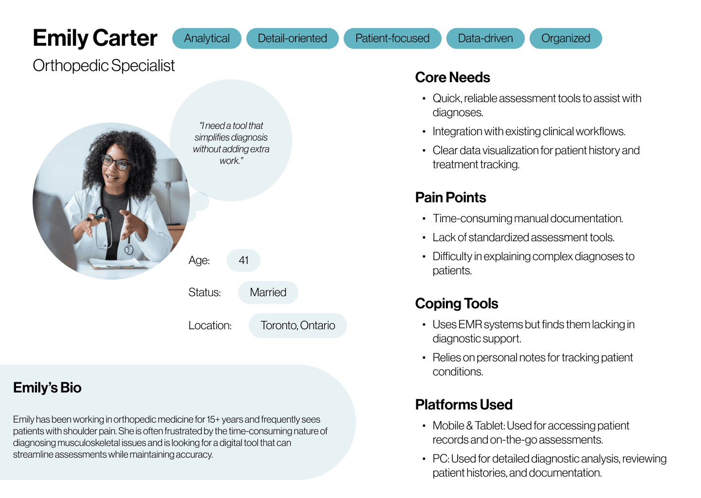
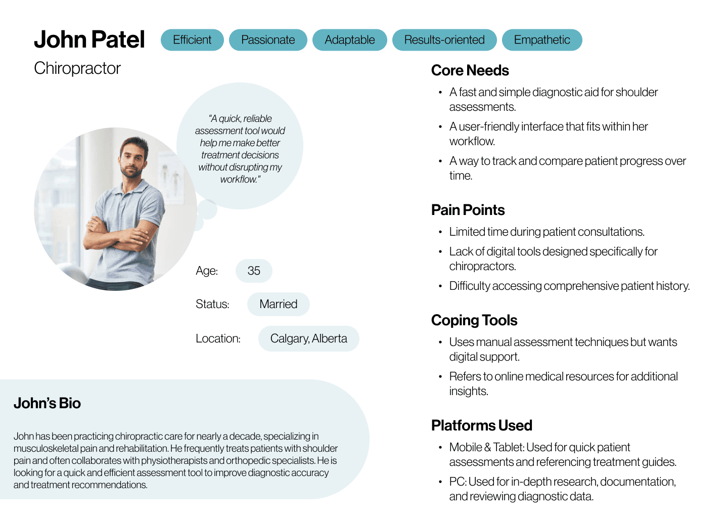
User Personas - Emily Carter (Orhopedic Specialist) and John Patel (Chiropractor)
User Personas - Emily Carter (Orhopedic Specialist) and John Patel (Chiropractor)
Phase 2
Phase 2
Phase 2
Research & Scoping Review
Research & Scoping Review
Research & Scoping Review
Validate the need for a digital solution through literature review.
Validate the need for a digital solution through literature review.
Validate the need for a digital solution through literature review.
Phase
Overview
Phase
Overview
Phase Overview
To determine the need for a digital clinical decision tool, we used Covidence to review existing research and filtered about 11,000 of studies to identify key insights. After refining our selection, we focused on 22 relevant articles that validated the need for a structured digital tool. These findings highlighted gaps in current assessment methods and informed our design approach.
To determine the need for a digital clinical decision tool, we used Covidence to review existing research and filtered about 11,000 of studies to identify key insights. After refining our selection, we focused on 22 relevant articles that validated the need for a structured digital tool. These findings highlighted gaps in current assessment methods and informed our design approach.
To determine the need for a digital clinical decision tool, we used Covidence to review existing research and filtered about 11,000 of studies to identify key insights. After refining our selection, we focused on 22 relevant articles that validated the need for a structured digital tool. These findings highlighted gaps in current assessment methods and informed our design approach.

Covidence Tool - Voting UI
Covidence Tool - Voting UI

Covidence Tool - Review Summary UI
Covidence Tool - Review Summary UI
Key
Findings
Key
Findings
Key Findings
Through our research review, we identified critical gaps in current clinical decision-making for shoulder assessments:
Through our research review, we identified critical gaps in current clinical decision-making for shoulder assessments:
Through our research review, we identified critical gaps in current clinical decision-making for shoulder assessments:
Lack of Accessible Tools
Lack of Accessible Tools
Lack of Accessible Tools
Most clinicians rely on lengthy, complex guidelines, making assessments inefficient.
Most clinicians rely on lengthy, complex guidelines, making assessments inefficient.
Most clinicians rely on lengthy, complex guidelines, making assessments inefficient.
Misdiagnosis Risks
Misdiagnosis Risks
Misdiagnosis Risks
Inconsistent evaluation methods contribute to unnecessary treatments, including expensive MRIs and avoidable surgeries.
Inconsistent evaluation methods contribute to unnecessary treatments, including expensive MRIs and avoidable surgeries.
Inconsistent evaluation methods contribute to unnecessary treatments, including expensive MRIs and avoidable surgeries.
Need for Digital Support
Need for Digital Support
Need for Digital Support
Studies showed that digital clinical tools improve decision-making and streamline workflows.
Studies showed that digital clinical tools improve decision-making and streamline workflows.
Studies showed that digital clinical tools improve decision-making and streamline workflows.
Phase 3
Phase 3
Phase 3
Prototype Development
Prototype Development
Prototype Development
Design an intuitive clinical decision aid based on research findings.
Design an intuitive clinical decision aid based on research findings.
Design an intuitive clinical decision aid based on research findings.
Phase
Overview
Phase
Overview
Phase Overview
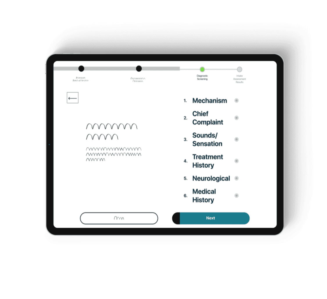
In this phase, I translated research insights into a functional prototype. I started by sketching wireframes in Miro to map out key interactions and structure. Then, I created a lo-fi prototype in Uizard to test usability and refine the design based on feedback. Once validated, I built a hi-fi prototype in Figma, focusing on simplicity, professional aesthetics, and a user-friendly experience. I also mapped out two key user flows to ensure a smooth and intuitive diagnostic process.
In this phase, I translated research insights into a functional prototype. I started by sketching wireframes in Miro to map out key interactions and structure. Then, I created a lo-fi prototype in Uizard to test usability and refine the design based on feedback. Once validated, I built a hi-fi prototype in Figma, focusing on simplicity, professional aesthetics, and a user-friendly experience. I also mapped out two key user flows to ensure a smooth and intuitive diagnostic process.
In this phase, I translated research insights into a functional prototype. I started by sketching wireframes in Miro to map out key interactions and structure. Then, I created a lo-fi prototype in Uizard to test usability and refine the design based on feedback. Once validated, I built a hi-fi prototype in Figma, focusing on simplicity, professional aesthetics, and a user-friendly experience. I also mapped out two key user flows to ensure a smooth and intuitive diagnostic process.
Wireframes
Wireframes
Wireframes
I sketched wireframes in Miro to map out the core flow of the tool, ensuring a clear and intuitive user journey from the start.
I sketched wireframes in Miro to map out the core flow of the tool, ensuring a clear and intuitive user journey from the start.
I sketched wireframes in Miro to map out the core flow of the tool, ensuring a clear and intuitive user journey from the start.

Screening for Red Flags Flow
Screening for Red Flags Flow
I placed the red flag screening at the start to ensure serious issues are caught early, keeping the focus on patient health and timely care. This helps clinicians act quickly and make better treatment decisions. At the end of the screening, users receive a list of nearby EMS and MSK-specialized clinics for easy patient referrals.
I placed the red flag screening at the start to ensure serious issues are caught early, keeping the focus on patient health and timely care. This helps clinicians act quickly and make better treatment decisions. At the end of the screening, users receive a list of nearby EMS and MSK-specialized clinics for easy patient referrals.
I placed the red flag screening at the start to ensure serious issues are caught early, keeping the focus on patient health and timely care. This helps clinicians act quickly and make better treatment decisions. At the end of the screening, users receive a list of nearby EMS and MSK-specialized clinics for easy patient referrals.

Low Fidelity
Prototype
Low Fidelity
Prototype
Low Fidelity Prototype
I created a lo-fi prototype in Uizard to test usability, focusing on core interactions and user flow. This allowed me to gather feedback early and refine the design before moving into high-fidelity development.
I created a lo-fi prototype in Uizard to test usability, focusing on core interactions and user flow. This allowed me to gather feedback early and refine the design before moving into high-fidelity development.
Uizard Prototype - Patient Demographics Low Fidelity Prototype
Uizard Prototype - Patient Demographics Low Fidelity Prototype
Note: Access to Uizard prototypes is locked due to subscription limitations. Unfortunately, I wasn't able to retrieve them, but the insights gained from testing still informed the final design.
Note: Access to Uizard prototypes is locked due to subscription limitations. Unfortunately, I wasn't able to retrieve them, but the insights gained from testing still informed the final design.
High Fidelity Prototypes
High Fidelity Prototypes
High Fidelity Prototypes
High Fidelity Prototype
For the hi-fi prototype, I used Figma to create a simple yet professional interface. My focus was on clean layouts, effective use of whitespace, and an intuitive design to ensure that clinicians could navigate the tool efficiently without feeling overwhelmed.
For the hi-fi prototype, I used Figma to create a simple yet professional interface. My focus was on clean layouts, effective use of whitespace, and an intuitive design to ensure that clinicians could navigate the tool efficiently without feeling overwhelmed.
For the hi-fi prototype, I used Figma to create a simple yet professional interface. My focus was on clean layouts, effective use of whitespace, and an intuitive design to ensure that clinicians could navigate the tool efficiently without feeling overwhelmed.

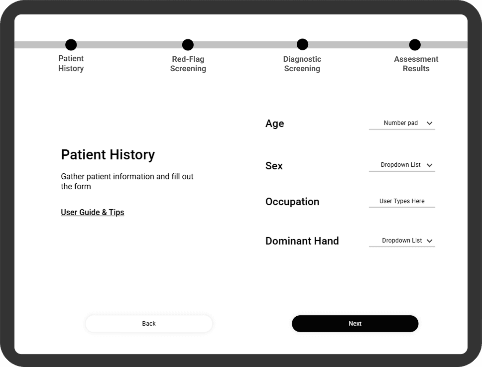
Screening for Red Flags - Hi-Fi
Screening for Red Flags - Hi-Fi
In the hi-fi prototype, the red flag screening remains at the start to catch serious issues early and prioritize patient health. The refined design makes it easier for clinicians to act quickly, and at the end, users get a list of nearby EMS and MSK-specialized clinics for seamless referrals.
In the hi-fi prototype, the red flag screening remains at the start to catch serious issues early and prioritize patient health. The refined design makes it easier for clinicians to act quickly, and at the end, users get a list of nearby EMS and MSK-specialized clinics for seamless referrals.
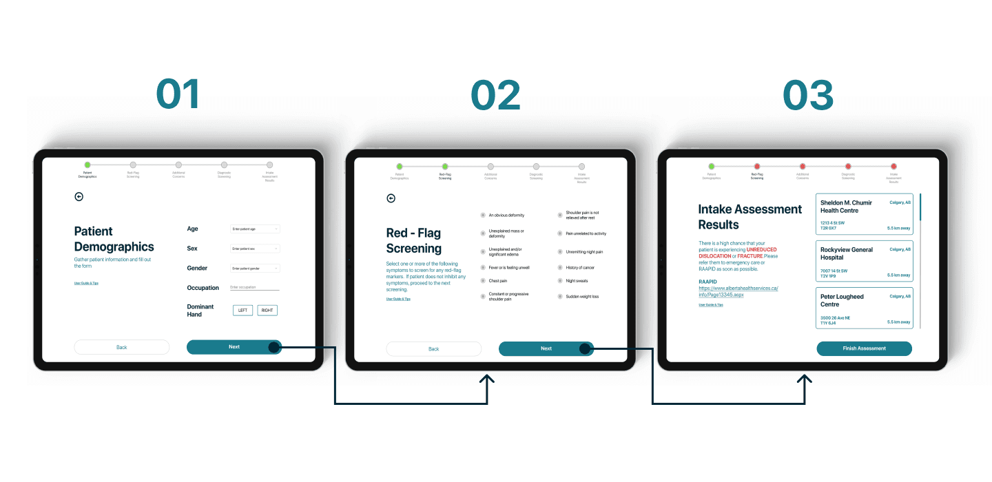
Figma Prototypes - Screening for Red Flags
Figma Prototypes - Screening for Red Flags
Note: Access to Uizard prototypes is locked due to subscription limitations. Unfortunately, I wasn't able to retrieve them, but the insights gained from testing still informed the final design.
Note: Access to Uizard prototypes is locked due to subscription limitations. Unfortunately, I wasn't able to retrieve them, but the insights gained from testing still informed the final design.
This project is still a work in progress, and I plan to continue refining it by setting up the design process on the website, ensuring a clear and structured overview of my approach, iterations, and key insights.
This project is still a work in progress, and I plan to continue refining it by setting up the design process on the website, ensuring a clear and structured overview of my approach, iterations, and key insights.